Desktop Mega Menu Slide Menu Tab Bar

Turbo Powersports — a wide catalog, navigation tightened up with 3 menu types

A short story about how a powersports store reorganized navigation for its customers on both desktop and mobile — without switching themes, without dropping any existing app.

TP
Turbo Powersports
turbopowersports.com
Powersports retail Shopify Wide catalog
At a glance
Industry
Powersports retail (ATV / Snowmobile / Jet Ski)
Platform
Shopify
Challenge
A wide, multi-level catalog with no mega menu
Navi+ menus
Desktop Mega Menu · Slide Menu · Tab Bar
Focus
Opening up the catalog on desktop, multi-level navigation on mobile

The customer's problem

Turbo Powersports sells parts and accessories for ATV, snowmobile, and jet ski — a very wide catalog with many category levels. The theme they were using had only a simple header menu and a hamburger slide menu on mobile.

Two clear problems:

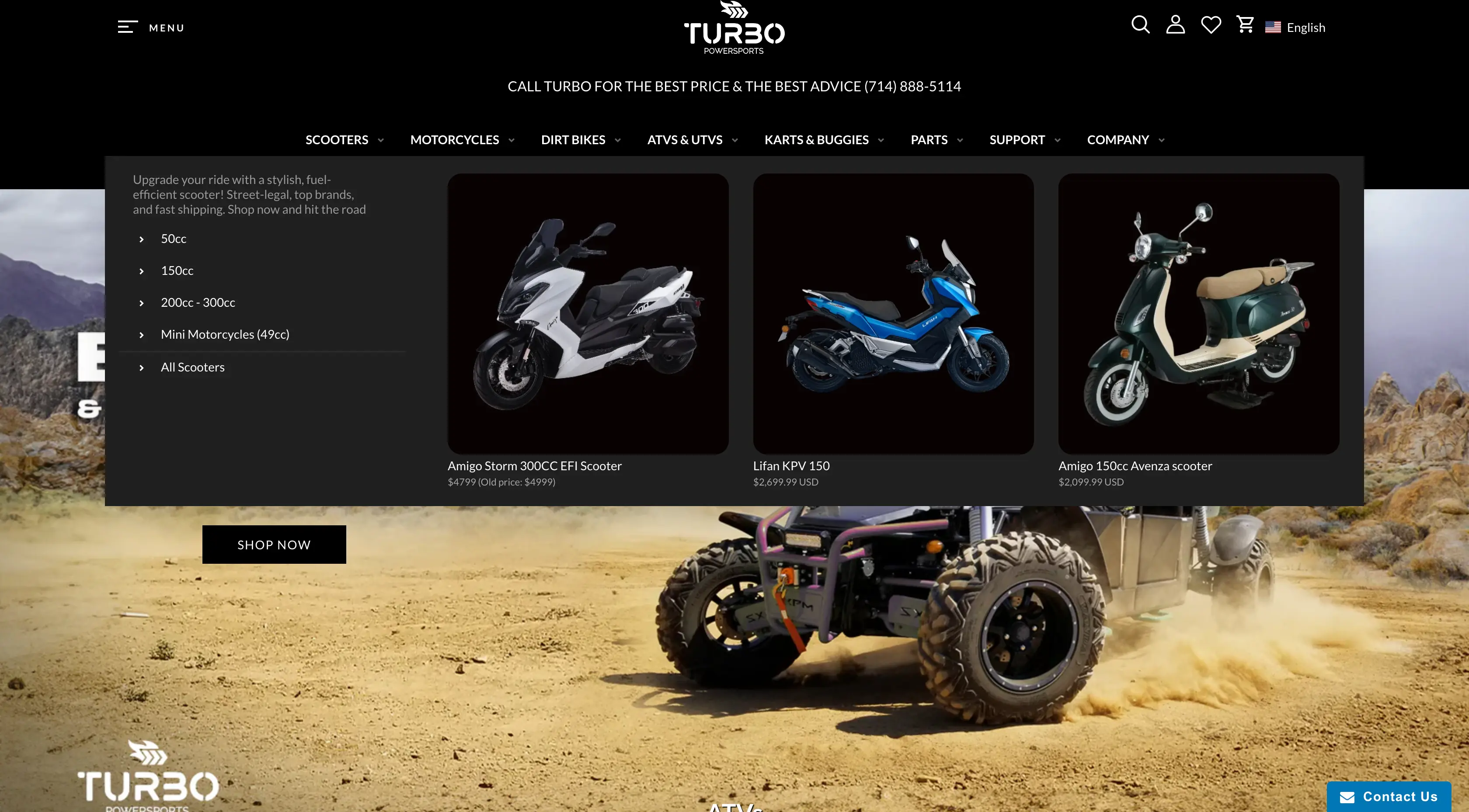
1. No mega menu — the whole catalog was hidden behind a short dropdown in the header. Visitors landing on the store couldn't tell what was being sold, there were no representative images, and no easy way to glance through the main product groups.

Before Navi+ — no mega menu, categories hidden
The header had only a flat menu bar — no mega menu, no imagery
Before Navi+ — categories hidden on mobile
Mobile: customers had to tap the hamburger to even see the menu — no hint about the catalog at all

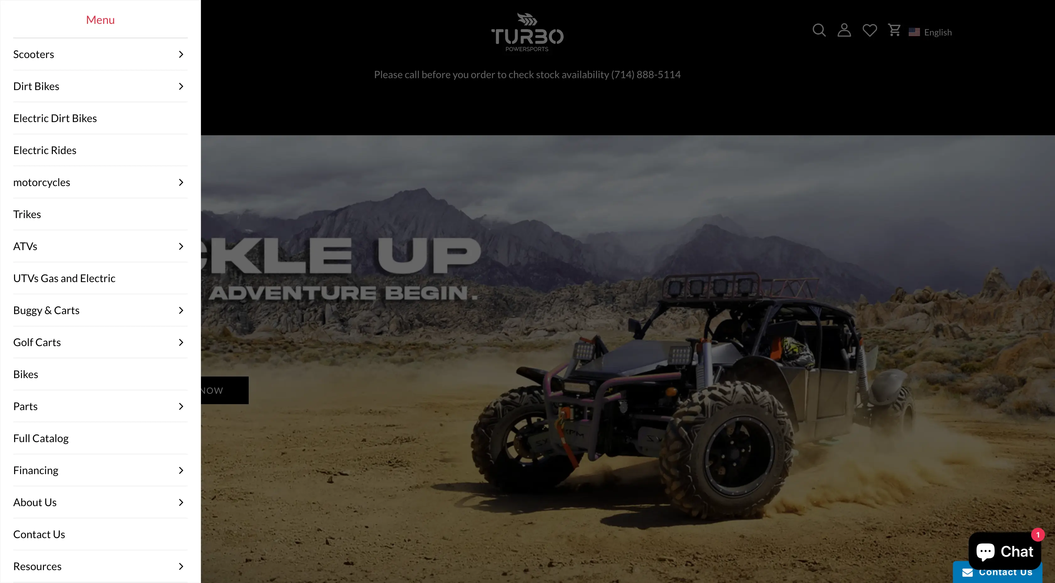
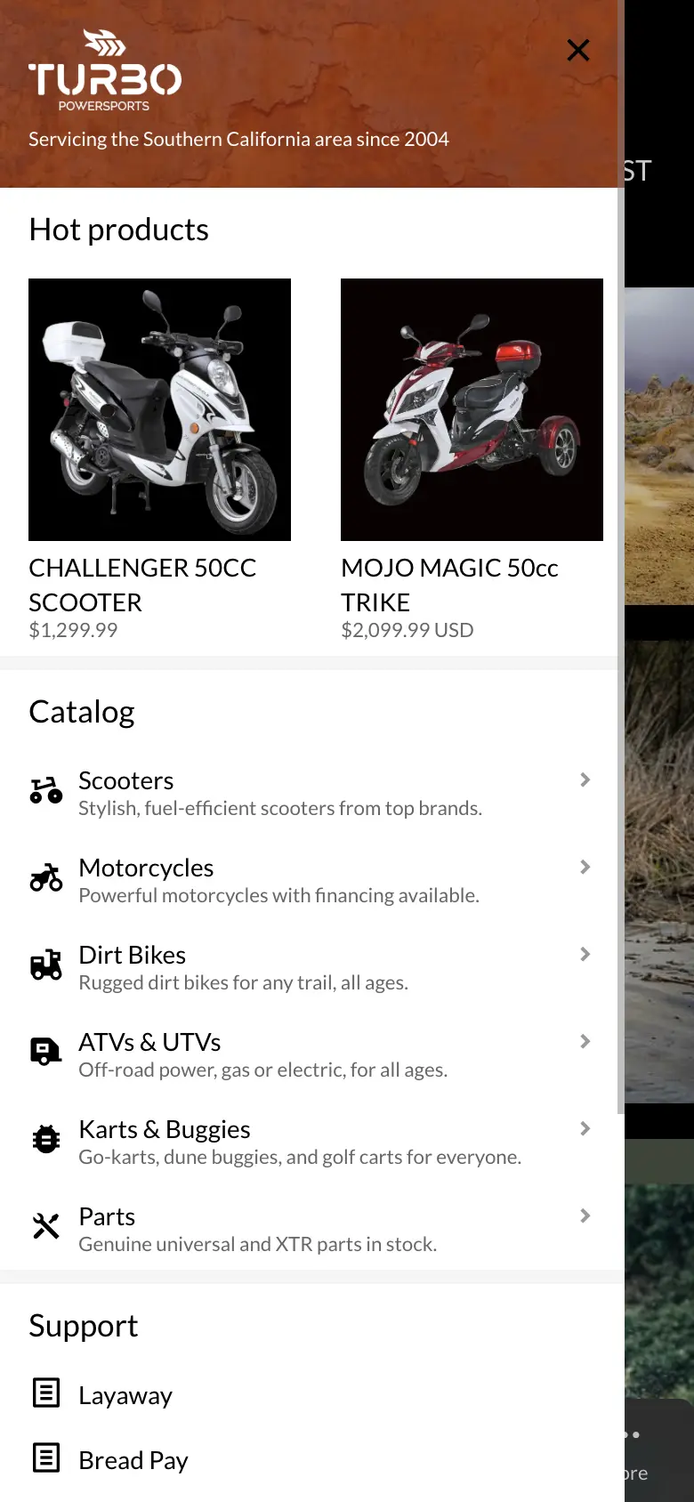
2. Slide menu was basic, not properly tiered — the theme's default slide menu was there, but it only listed top-level items, without enough sub-levels for a catalog this deep.

Slide menu before Navi+ — basic, no tiering
The slide menu had only one level — sub-categories didn't reflect the real structure

What Navi+ solves

I suggested Turbo Powersports keep their theme as is, leave the layout untouched — and just drop three Navi+ menus into the right places. Each menu handles a different job:

Desktop Mega Menu — opening the catalog right in front of the customer

On desktop, the mega menu is split into clear columns: by vehicle type (ATV / Snowmobile / Jet Ski / UTV…), by parts group (Engine / Body / Wheels…), with a representative image for each group. Hover once and the whole store opens up — no guessing, no trial clicks.

Slide Menu — unlimited tiers, works on both desktop and mobile

The slide menu handles the deeper part of the catalog — sub-groups under each vehicle type, each line, each model year. On mobile, customers tap the hamburger, it slides open, and they drill through levels just like a native app. On desktop, the slide menu acts as a fallback for customers who prefer list-style navigation (instead of hovering through the mega).

Tab Bar — consolidates the header, opens key panels directly

Mobile-only, fixed at the bottom of the screen. Each tab isn't just a navigation link — it also opens the Cart panel, Search panel, and Slide menu right where the customer is. Because of that, the header gets cleaned up: no need to cram a cart icon, a search icon, and a hamburger up top anymore — the header becomes noticeably simpler, every function stays intact, and it all lives within thumb's reach.

What changed — results after Navi+

The category structure was reorganized clearly and shown in full on both desktop and mobile. Customers can tell what the store sells, who the brand is, and where to find what they need — from the very first second.

After Navi+ — full Desktop Mega Menu
Desktop: a full Mega Menu — categories laid out in clear columns, each with a representative image
After Navi+ — mobile Tab Bar opens Slide / Search / Cart
Mobile: Tab Bar at the bottom — opens the Slide menu, Search panel, and Cart panel (replacing every icon that used to live in the header)
After Navi+ — full, engaging Slide menu
Slide Menu: fully tiered, with imagery — far more engaging than the default

The outcome: product awareness and brand awareness are both addressed, and the new product category structure is friendly and clear. No theme swap, no app removed.

See it live

Walkthrough of the 3 menus on the Turbo Powersports store

Key principles

These apply to most stores with a wide, multi-level catalog — not just Turbo Powersports.

  • Desktop is for discovery: a mega menu split into columns by vehicle type and parts group shows customers the whole catalog with a single hover.
  • Mobile is for going deep: a fully tiered slide menu moves from vehicle type → line → year like a native app.
  • Pull actions into the Tab Bar: cart, search, and menu open straight from the bottom bar — the header gets cleaned up without losing any function.
  • Add a layer, don't replace the foundation: three menus dropped into the right places, no theme swap, no app removed.

Have a similar store and want to try Navi+? Check out the menu types or read the documentation.

K
Khoi — Founder, Navi+
Builds Navi+ and personally advises Shopify stores with large catalogs on their navigation.

Get started with Navi+ AI Menu Builder

Pick your platform — free to install, live in minutes.