Every store already has a top menu.
The question is
what goes at the bottom.
Bottom navigation has become the mobile standard. Your customers expect it. But success isn't about adding it everywhere — it's about deciding what belongs there, and placing it where it actually works. This guide helps you get that decision right.

Safe zones vary across devices
iOS notches, Android gesture bars, and landscape mode all claim screen real estate. A menu at the bottom must coexist with these hardware realities, not fight them.
Bottom navigation competes with your content
Placing a bar at the bottom reserves space that could show product images or the add-to-cart button. The wrong placement makes scrolling harder or hides key actions.
It only works with a specific number of items
A 5-item navigation bar is usable. 7 items becomes cramped. More than 8 is unusable. You need to decide what actually goes there — not everything can fit.
It coexists with other navigation
Most stores keep a top header and a drawer menu. Bottom navigation doesn't replace them — it layers on top. Getting these three to work together requires planning.
Effective mobile navigation puts your most important destinations in the three to five slots at the bottom, and works alongside your top menu and mobile menu rather than replacing them.
Home, Shop, Search, Cart, Account — the standard set
Most mobile stores settle on these five. Home gets you back quickly. Shop is your catalog. Search helps visitors find specific items. Cart and Account are transactional. Anything beyond these five usually means something doesn't belong.
Set the height and spacing yourself
iOS home indicators and Android gesture zones require padding. The bar moves up slightly to stay usable and touchable, not hidden behind gestures or OS controls.
Works in portrait and landscape
Landscape mode has less vertical space. A well-designed bottom bar shrinks gracefully or stacks items without breaking the layout or becoming unreadable.
Layers with your header and drawer
The top header stays for branding and quick search. The drawer holds deep categories. The bottom bar bridges them — fast access to the most-used pages without opening a menu.
Skips certain store types
Not every store benefits from bottom navigation. Single-product shops, luxury brands with minimal catalogs, and desktop-heavy stores may not need it. Know your traffic patterns first.
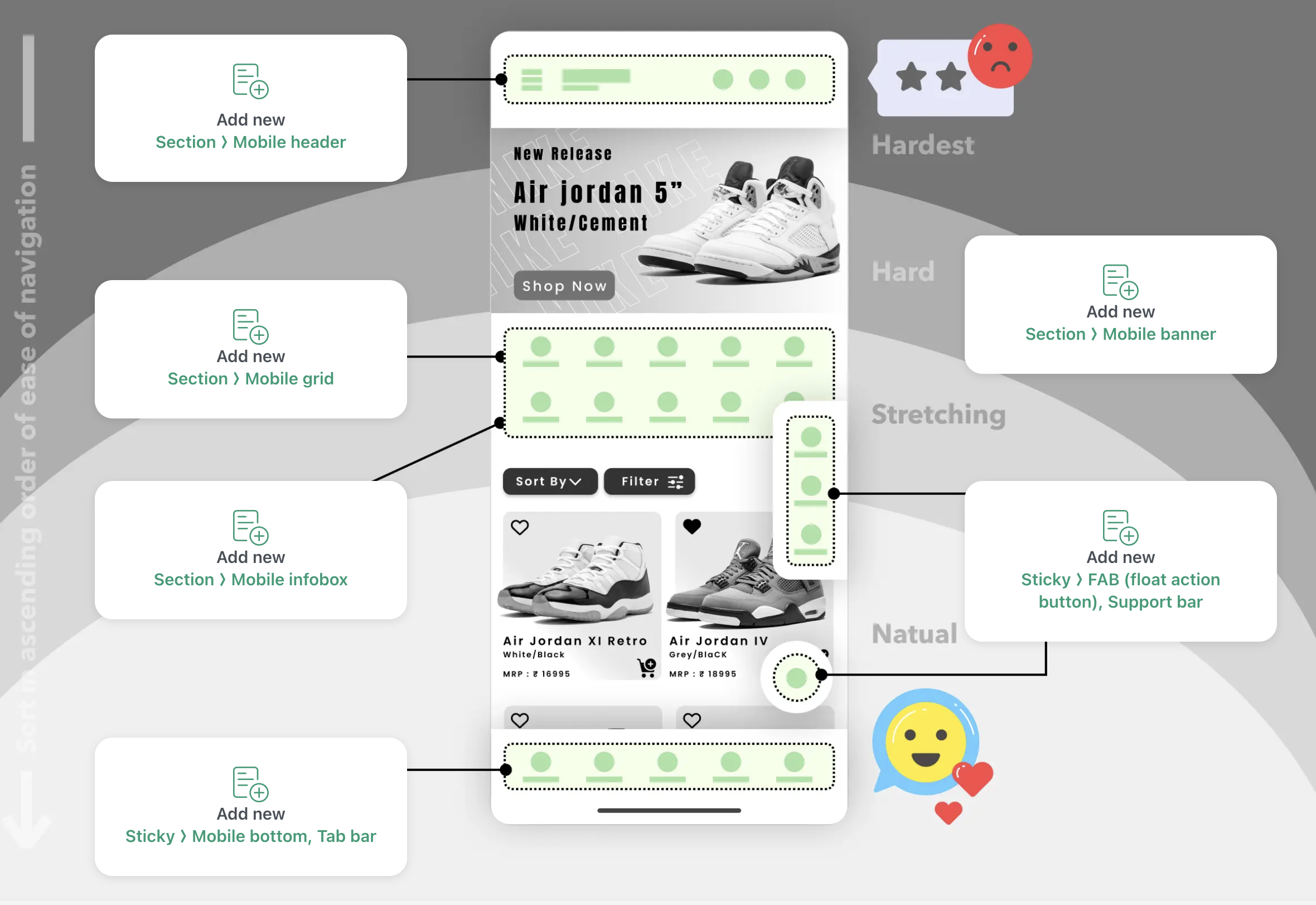
Audit your store traffic and goals
Check analytics. Which pages do mobile users visit most? Which actions matter most for your business? Slot five destinations into your bottom bar — no more.
Decide what earns a slot
Decide which phones your customers use most. Plan padding for notches and gesture bars. Test landscape mode. A few minutes of planning saves mobile friction later.
Set up your bottom navigation with Navi+
Choose your destinations, icons and colours, then set the breakpoint that decides when the bar appears on mobile and when it does not. Publish and go live in minutes.
Height and padding you control
Set the bar height, icon size and padding yourself, so it sits comfortably above the bottom edge on the devices your customers actually use.
Adapts to landscape mode
Bottom bar shrinks and reflows when users rotate their phones. Layout stays usable, never cramped or hidden.
Layers correctly with other UI
Works alongside fixed headers, drawer menus, and popovers without z-index conflicts or overlaps.
Slot management
Clear visual slots help you place exactly what matters. Unused slots stay empty — no forced filler items.
Multi-market ready
Multi-language menus are available on Business and above, so the labels in your bar can follow the language your visitor is browsing in.
No performance impact
Lightweight CSS and HTML. No JavaScript overhead, no library bloat. Your store loads just as fast as before.
When top-level pages live in a visible bar at the bottom of every screen, more visitors use them. Categories get browsed. Accounts get checked. Wishlists get used. The patterns customers already know from Instagram and Amazon work just as well on your store.
Tab Bar
Add a mobile Tab Bar to your Shopify store. Fixed bottom navigation like a native app — boost engagement an...
Mobile Menu
Replace your theme's hamburger drawer with a multi-level menu. Built-in search, account access, and drill-d...
Floating Button
Add a sticky contact button to your Shopify store. Always visible — WhatsApp, phone, email, live chat. Neve...
Free to install. Live in under 5 minutes. No theme edits required.